by urbandata | Apr 6, 2013 |
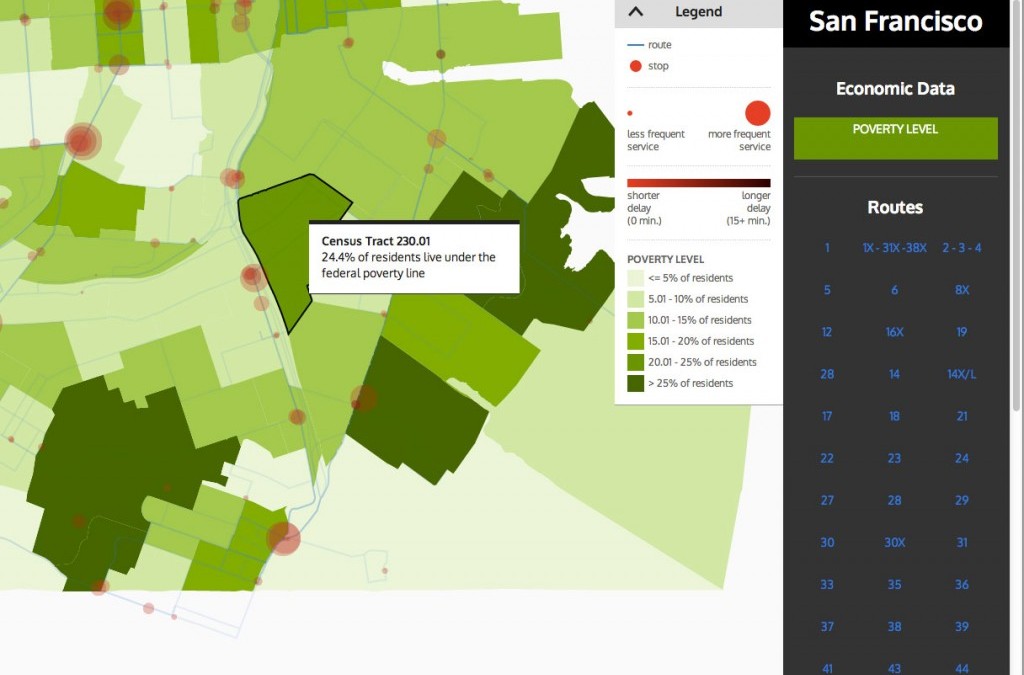
Transit Quality + Equity Second Prize Two round-trip flights to San Francisco, Zurich, or Geneva Transit performance is often solely measured by speed and efficiency. But how well do transit systems actually serve the diverse populations in a city? Do people of different economic classes experience different quality of service and access? By overlaying transit data with income levels, these maps visualize the equity impacts of transit service. Project Link Transit Quality + Equity Project Team Raymon Sutedjo-The Sandra Lee ← Back to Urban Data...
by urbandata | Apr 6, 2013 |
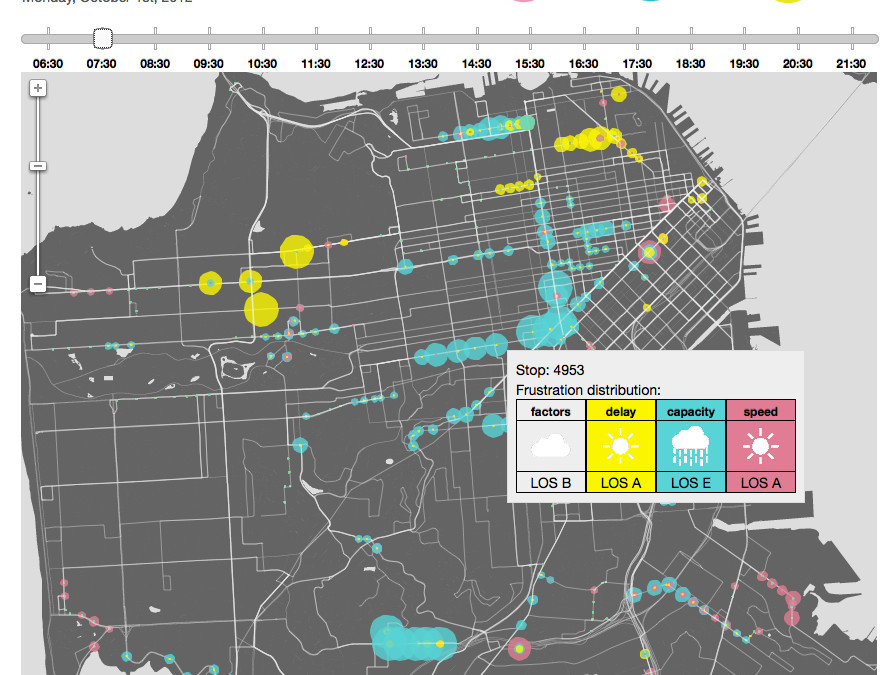
Second Prize Two round-trip flights to San Francisco, Zurich, or Geneva Frustration Index shows the Level of Service (or Frustration) for transit services in San Francisco, Geneva, and Zurich. Our web application visualizes frustration factors (capacity or crowdedness, delay, and speed) for one day in October 2012 across the three cities. More background information can be found on the project’s about page. Project Link Frustration Index Project Team Srinivas Ashok Daphné Dethier Carmel Dudley Steve Pepple ← Back to Urban Data...
by urbandata | Apr 6, 2013 |
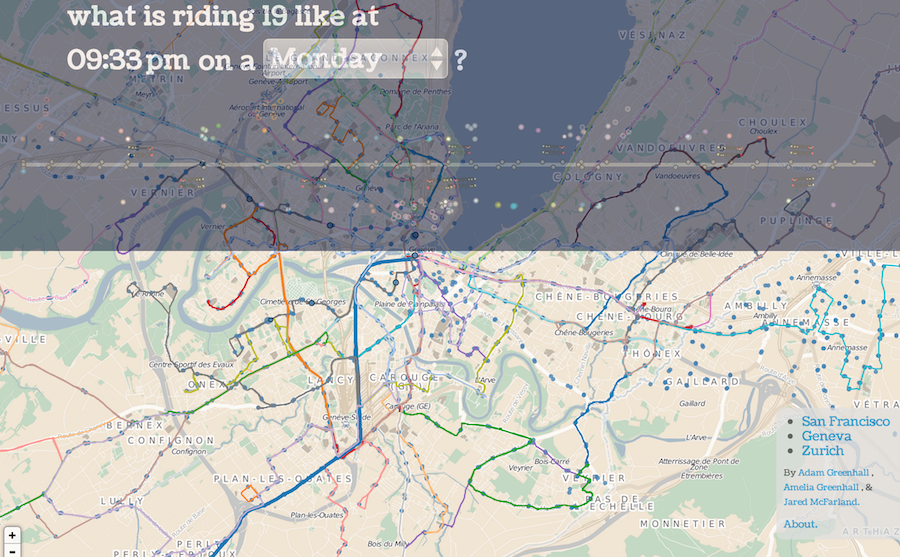
Grand Prize Winner Up to $5,000 from Fusepool to develop an app, in partnership with the cities of San Francisco, Zurich, and Geneva. Sometimes riding transit can seem intimidating, but this visualization proves it: everybody’s doing it. Pick a route off the map and watch a day in the life of the line. Buses speed by, passengers jumping on and off. Some lines are slow, some are hopping, and rush hour is often hilarious. Project Link Dots on the Bus: San Francisco Dots on the Bus: Zurich Dots on the Bus: Geneva Project Team Adam Greenhall Amelia Greenhall Jared McFarland ← Back to Urban Data...