by urbandata | Apr 9, 2013 |
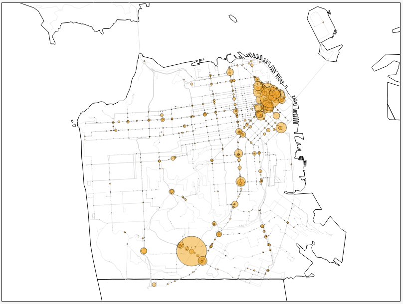
Honorable Mention + Data Canvas Challenge 2013 International Exhibit Recommendation This visualization seeks to expose: – Which are the busiest routes at different times of the day – Congestion analysis – a particular stretch of road may be busy because there are multiple bus services travelling along that same road. Project Link BuzzStop Project Team Fransisca Fortunata Geoffrey Goh Shih Fu Hua Kam Tin Seong, Singapore Management...
by urbandata | Apr 9, 2013 |
Breakpoints Honorable Mention Data Canvas Challenge 2013 International Exhibit Recommendation How can we get people engaged with transportation data? One of the possibilities explored by this project is the use of video games mechanism, such as scoring. A single day of transportation data is played back in 3 minutes. The visualisation shows the bare minimum, e.g. transportation lines, stations and buses moving between those stations. At any time during this process, the viewer has the opportunity to become active and interact with the data by interfering with the traffic. The moment he starts adding new informations to the visualisation, he creates a parallel reality where each of his action has consequences, good or bad. The original data sets, based on public transports information from San Francisco, Geneva or Zurich on October 4th, 2012, are then changed and the outcome of this day of experimentation is different than what happened on this day in reality. Project Link Breakpoints Project Team Jeremy Boy Louis Eveillard ← Back to Urban Data...
by urbandata | Apr 6, 2013 |
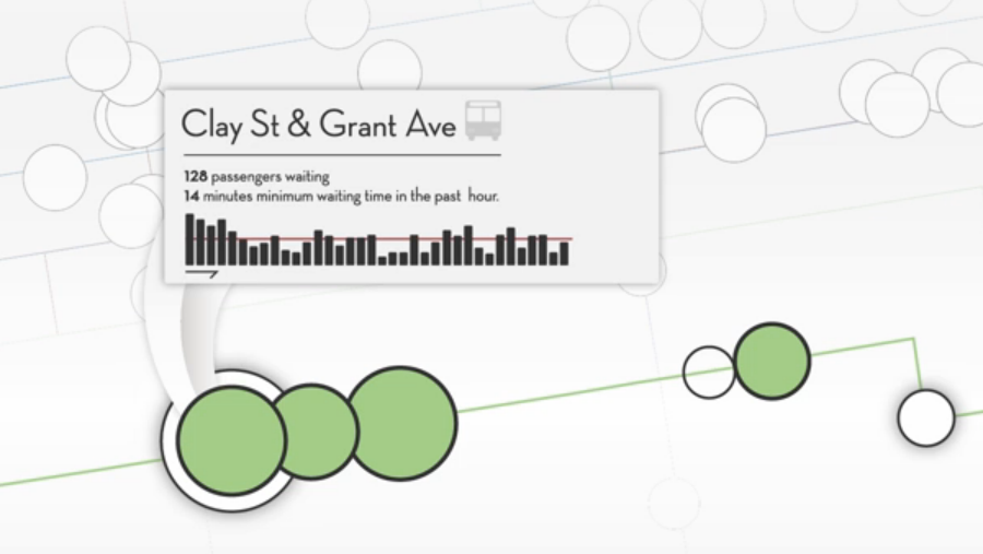
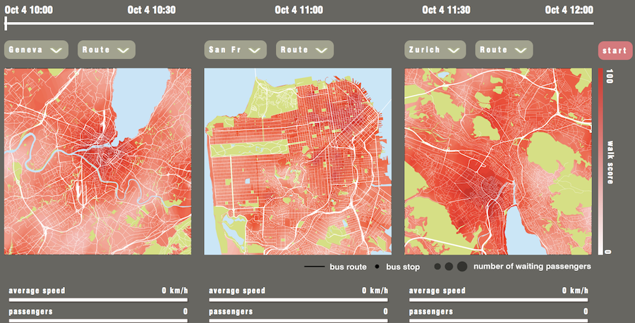
Urban Bus Races Third Prize $300 cash Powered by transit data from San Francisco, Zurich and Geneva, Urban Bus Races is an interactive tool that allows users to visualize, measure, and compare bus route performance using actual transit data. Urban Bus Races indicates the location of buses operating on the routes selected, during the date and hour selected (local time). The size of the grey circles along the routes represent the number of passengers waiting at the stop. When a bus, represented by a small white circle, arrives at a stop, all waiting passengers board the bus and the grey circle shrinks to show that the passenger queue has been served. This allows users to quickly visualize areas of the city where large queues are forming, by time of day. Large queues may be an indication that reliability needs to be improved to reduce gaps between buses or that service frequencies need to be increased to satisfy demand. The background maps are color-graduated according to the corresponding Walk Score®, to highlight areas of the city with more accessible destinations within walking distance of a transit stop. Project Link Urban Bus Races Project Team Ben Juhn Jed Horne Nicole Foletta Laura Shifley ← Back to Urban Data...
by urbandata | Apr 6, 2013 |
TransitVis Third Prize $300 cash TransitVis is an iPad app that lets users examine transit ridership data from public agencies. Given a properly formatted data set, a user can see various statistics over a selected time period. Users can tap on individual stops to drill down into the data or zoom out to see overall trends. The app provides a map layer underneath the data and the ability to move around in 3D to see how things relate to each other. Project Link TransitVis Project Team Michael Dougherty Steve Gifford ← Back to Urban Data...
by urbandata | Apr 6, 2013 |
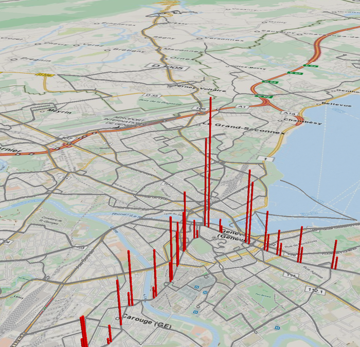
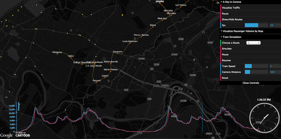
A City’s Heartbeat Third Prize $300 cash “A City’s Heartbeat” is a web-based interactive visualization using Geneva’s transportation dataset. This project has three main features. Firstly, we transformed the transportation dataset into a data cube format, which allows us to render big, time series data in the client. A playback of tram movements over a 2 day period allows us to “feel the pulse” of the city. Feature two aims to visualize the volume of passengers over time. By using CSS 3, we utilised 2½ dimension to illustrate the passenger volume in each tram station. A complimentary D3.js line graph plots the overall passenger volume for the entire city. This visualization is our interpretation of the city’s “blood pressure”. In the third feature, we bring users into the 3rd Dimension by taking them on a tour of the real Geneva city’s tram routes. Users will experience the journey through a realistic 3D environment, and be able to see what is around the tram route. We believe this visualization adds additional meaning and context to the previous two parts. Project Link A City’s Heartbeat Project Team Max Xu Adrian Vu Zi Xin Chong ← Back to Urban Data...