by urbandata | Apr 9, 2013 |
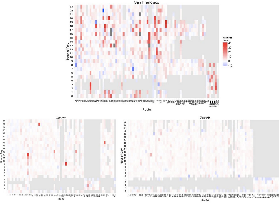
Honorable Mention + Data Canvas Challenge 2013 International Exhibit Recommendation Project Description Public transit passengers are well aware of how full their buses will be and how much buffer time they should give themselves to get to their destination on their daily commute. However, how do they compare with other routes in the system or other cities? This project presents a few visualizations to compare and contrast between San Francisco, Geneva, and Zurich to see which city does a better job overall as well as particular routes and time of day where they can be further analyzed or improved. The plots show that San Francisco performs the worst in terms of reliability and over-capacity. In terms of peak riderships, Geneva has especially high peak loads during the morning, lunchtime, and evening commute compared to other times of the weekday. San Francisco also experiences some peak loads during the morning and afternoon commutes, but there were not as prominent compared to Geneva. Project Link Reliable + Pleasant Transit Project Team Tak...
by urbandata | Apr 9, 2013 |
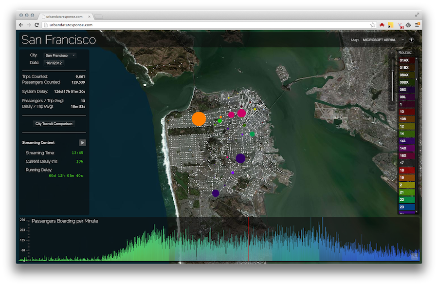
Honorable Mention + Data Canvas Challenge 2013 International Exhibit Recommendation I wanted to build a tool that analyzes public transit information and visualizes realtime arrival data for every minute of the day — showing the current load on the transit system, the current delays, where passengers are boarding, and more. My goal is to help understand when and where problems (i.e. delays) occur in public transit systems. I also wanted to provide comparisons between the three cities, Geneva, San Francisco, and Zurich, so we can all see which city has the best public transit system., and it looks like Zurich is the clear winner with both the least delays per trip and the most passengers handled per day. Project Link Urban Data Response Project Team Matt...
by urbandata | Apr 9, 2013 |
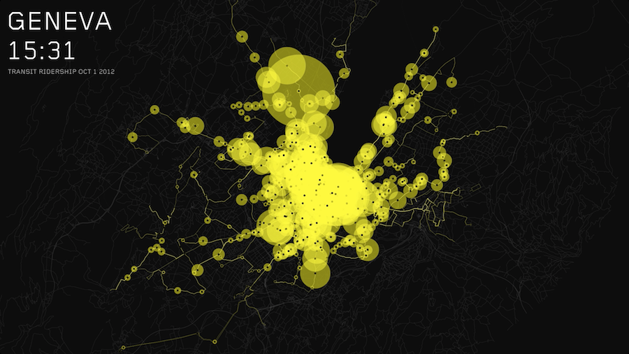
Honorable Mention + Data Canvas Challenge 2013 International Exhibit Recommendation Ridership is an identifier for how cities are utilized—whether they are centralized, decentralized or have multiple focal points, whether activity concentrates during rush hour as people are entering or leaving the city center(s), or whether activity is spread out over time. As the transit passenger data suggests, Geneva is centralized while Zurich appears to have multiple centers, and activity is concentrated during rush hours. Activity in San Francisco on the other hand is more evenly spread out, both spatially and over the course of the day. These insights are not only useful for city planners and transit authorities, who can get a sense of what areas see high and low ridership and understand what areas are underserved by public transit. Project Link Transit Patterns: San Francisco Transit Patterns: Zurich Transit Patterns: Geneva Project Team Christian Marc Schmidt Sergei...
by urbandata | Apr 9, 2013 |
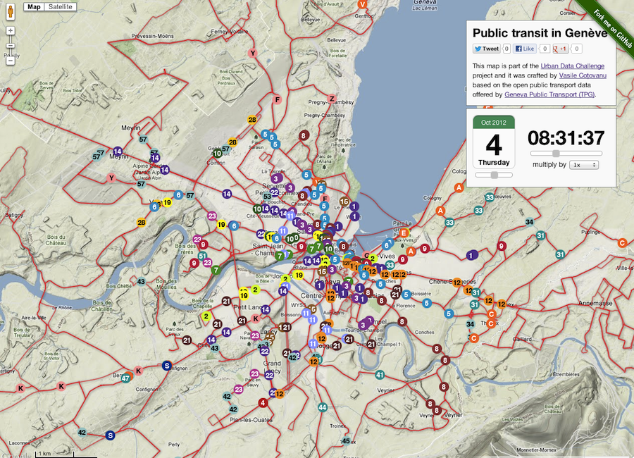
Honorable Mention + Data Canvas Challenge 2013 International Exhibit Recommendation The project is based on the previous work of public transport simulations available at http://simcity.vasile.ch and it’s powered by the ‘Vehicle Simulator’, an open-sourced script available at https://github.com/vasile/vehicle-simulator Features: – easily step back in time to see the vehicles network at one given moment from 1-7 October – get “real-time” information about the vehicle timetables, load and average speed – follow (drive) with the vehicle in a beautiful Bird-eye view imagery that make you feel that you are actually there – easy embed the map and customise the center, zoom, time – platform agnostic – runs on all modern browsers including tablets and small devices Project Link One Map, One Week in Public Transit Project Team Vasile...
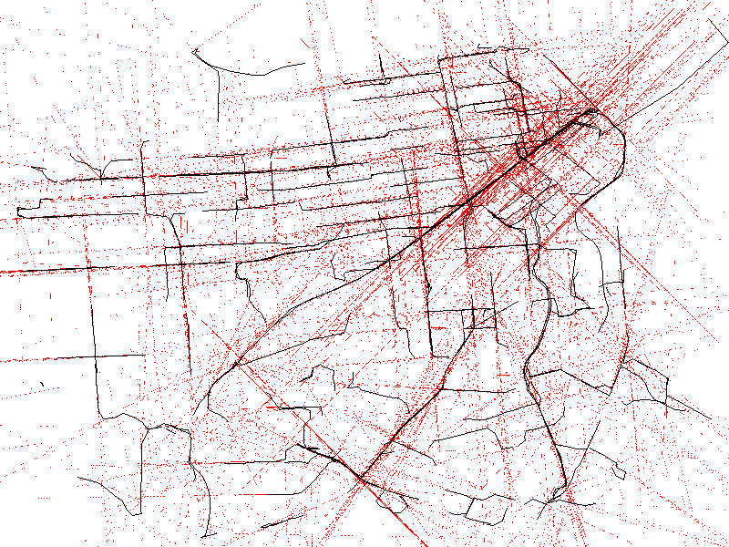
by urbandata | Apr 9, 2013 |
Honorable Mention + Data Canvas Challenge 2013 International Exhibit Recommendation MetroMapperSF utilizes the real-time data of all SF transit vehicles to draw out a map of the cities metro network. Every 10 seconds [API delay allowance] the data is updated, plotting the latest location of up to 650+ vehicles during peak time. Their given speed and heading are shown in read, pushed to an extreme speed, in order to map out an alternative grid of prediction. Project Link MetroMapperSF Project Team Ted...