by Emina | Mar 25, 2015 |
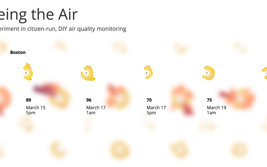
Maker Prize Winner Seeing the Air won one of three Maker Prize awarding $500 worth of goods and goodies from SeeedStudio. Project Description Seeing the Air is an experiment in citizen-run, DIY air quality monitoring. In many countries, air pollution reaches hazardous levels, and getting information air quality is difficult, if not impossible. Because of this, Seeing the Air concentrates on air quality, as it gives the project focus, and a sense of purpose. Inspired by Edward Tufte, Seeing the Air is intended to show how freely available data could be presented in a way that informs citizens, and enhances their knowledge. To accomplish this, the project includes set of visualizations for each of the seven cities. These allow users to explore the data, and help them to find answers to questions that affect the quality of life: Is the air ever hazardous? What is the air quality like during commute hours? How does my city stack up against others? Created by Kevin Gates & Ramesh Sampath (San Francisco, USA) Explore Seeing the...
by Emina | Mar 25, 2015 |
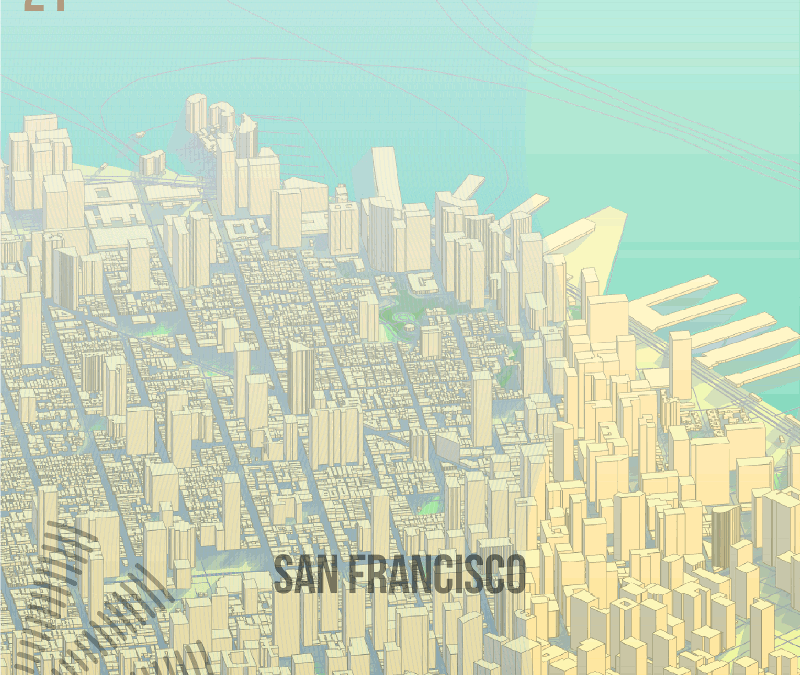
Maker Prize Winner Sensor Engine won one of three Maker Prize awarding $500 worth of goods and goodies from SeeedStudio. Project Description Sensor Engine is a visualisation of a single 24hr period across the sensor network, and includes example output for Boston, San Francisco, Singapore and Geneva. The source data was from a single day, 9th March 2015 with data in one hour intervals. The images are created by an entirely automated process written using FME software from Safe Software (www.safe.com). FME allows for the creation of reusable data transformation models, and supports over 300 formats of spatial (CAD, GIS, 3d, raster) and non-spatial (databases, spreadsheets, text files, xml) data. The input to the model are the csv sensor data files and some OpenStreetMap vector data covering each city. The first stage of the process creates the backdrop map for each city by dynamically reading map data based upon a latitude and longitude set for each city. Building height values are generated using a random number assigned to different polygon sizes, and extruded into 3d objects and rotated with the rest of the map features at -55 degrees along the x axis. Building shadows are made using an x & y coordinate offset of -0.0005 decimal degrees. The buildings (sorted by minimum y coordinate value so they don’t overlap) and other map features are styled and rasterised using a MapnikRasterizer transformer, and written out ready for the next stage. Next the model reads all sensor values at once and calculates statistics, so the images can visualise the data proportionally across all the cities in the 24 hour period. This done...
by Emina | Mar 25, 2015 |
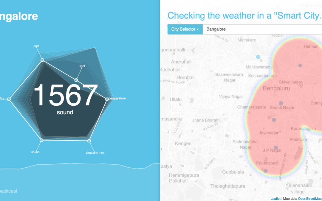
Maker Prize Winner Weather+ won one of three Maker Prize awarding $500 worth of goods and goodies from SeeedStudio. Project Description Data Canvas’ sensing network inspired me to consider what a typical weather application might look like in the future. With the ability to know environmental factors are more granular levels, one might imagine a new interface that accommodates the increase in variables we consider. This interface would need to enable the user to quickly update themselves on these various environmental factors with the same ease and corresponding wealth of data that we’ve become accustomed to with the weather. This includes forecasts for each associated measure (be it air quality, temperature, or even noise levels) as well as a spatial view of the information, much in the manner that we consider storm patterns within a region, but at smaller scale, in respect to the feature being presented. Weather+ intends to be a simple mechanism, demonstrating a core design concept that might enable these factors to be successfully displayed in a manner that provides the user with a positive and engaging experience. How to use Weather+: Move your hover your cursor over the hexagon that is generated by selecting a city. Move your cursor to the variable of interest. Doing so will produce a heatmap of that variable on the map to the right and generate a “24 hour backcast” of the results on the bottom of the screen, intended to mimic what might be a true 24 hour forecast when sensor volume has reached a critical mass. Created by Kuan Butts & Daniel Palencia (NYC, USA + Singapore)...