by Emina | Mar 25, 2015 |
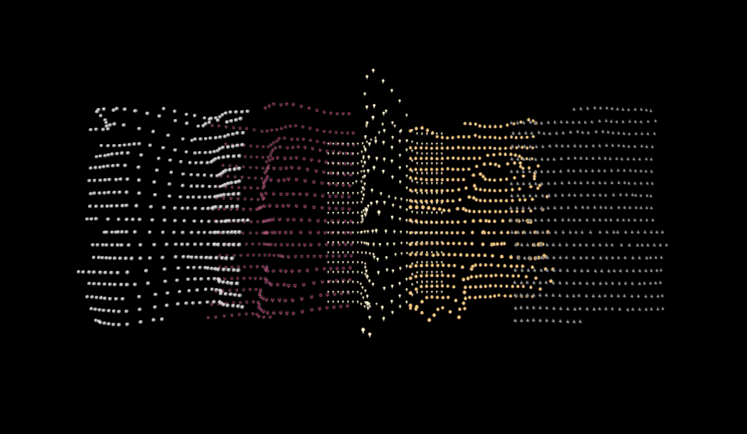
Selected for Exhibition Climate Change is eligible for Data Canvas exhibitions that will be curated both online and offline. Project Description ‘Climate Change’ can’t avoid the consequences of global warming, but it can provide distraction by exploring the sensor data in 3D. Depending on the chosen parameters, the user can produce readable data sculptures or pure data-dada. As default-textures Martin used emojis, nowadays common language. Martin wanted to explore if they can make sense in this context and if they could be transformed into something beautiful. In a future version he would like to add the possibility to change textures and their behavior in order to be able to create more diverse and meaningful images. This project was much fun as it allowed Martin to discover three.js and json. Martin also enjoyed creating his own tool, as a starting point to escape the boundaries of readymade software. Created by Martin Hertig (Lausanne, Switzerland) Explore Climate...
by Emina | Mar 25, 2015 |
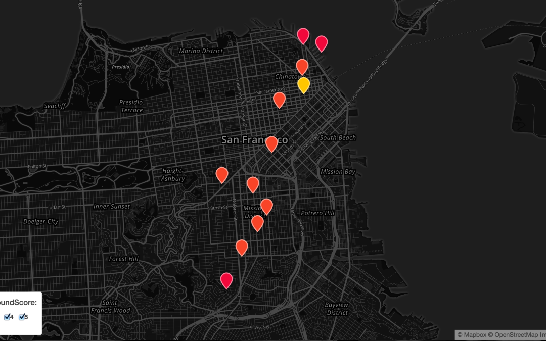
Selected for Exhibition SoundScore is eligible for Data Canvas exhibitions that will be curated both online and offline. Project Description SoundScore enables prospective renters and current tenants to see the sound of their neighborhood. This is similar to the idea behind WalkScore, which helps residents determine how walkable a neighborhood is and how close amenities are to them. We borrowed this model and envision adding sound as a factor so that current and prospective residents may take this into consideration when looking for a place to live. At SoundScore we believe in empowering the consumer and giving them complete control of information. Instead of forcing a narrative on them we provide interactive charts and graphs to allow users to slice and dice the data and discover the insights that matter to them. Visitors to the SoundScore site can get a feel for a city and through the map, dive into a neighborhood, exploring the sounds level by day of the week and time of day. We feel this is valuable to prospective renters because sound has a direct affect on quality of life. This factor is even more insightful at the level of hour. We withhold judgment on the quality of the sound and report noise levels only, allowing our users to determine if a quieter or louder neighborhood suits their lifestyle, whatever that may be. However, we have applied noise levels to our proprietary scale, ranking noise by level of intensity on a scale from 0–5, with 0 being the quietest and 5 being the loudest. For current tenants, we provide value by allowing them to quantify noise...
by Emina | Mar 25, 2015 |
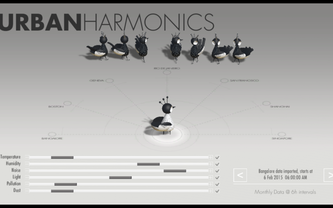
Selected for Exhibition Urban Harmonics is eligible for Data Canvas exhibitions that will be curated both online and offline. Project Description By now anyone interested in the field of data visualization is familiar with the elaborate designs that show relationships between nodes in data – hierarchical edge bundling, node-link trees, circle packing and the like. For this project, Bryan chose a radical departure – to humanize the data and try to establish meaning. This visualization is an interactive dating game. You are the main character, and you set your preferences and tolerances for dust, light, pollution and more. The cities will come to you based on your preferences. In addition, visual cues such as smoke, dust clouds and beads of sweat help you understand what quality each city is offering you. The project is a WIP, most of the design/modeling and programming is completed, but Bryan still am working on the motion of the cities as they move towards their potential mate. More refinement is needed, but Bryan thinks the project gives you a good idea of what he’s up to. Created by Bryan Leister (Denver, USA) Explore Urban...